Centri Design Ops Ecosystem
I built the workflow that carries a design change from Figma to code, for designers, engineers and AI agents.
- FigmaDesign sourceDesigners edit components and variables in the shared Figma library.
- NexusPluginThe Figma plugin. It publishes components (16 checks on each variant, then a version) and tokens (exported to GitHub).
- SupabaseRegistryThe registry. It keeps every version of each component: its changes, preview and the tokens it uses.
- SlackNotificationsEach release posts the component, its version and what changed.
 GitHubRepositoryNexus pushes the tokens here, where they build into CSS variables for the light and dark themes.
- VercelShowcaseDeploys the Showcase on each push. It reads the registry: live controls, tokens and version history.
*Click a box to read what it does.*Tap a box to read what it does.
No system between design and code
Centri’s design system began with version 2 of the platform. Until then there was none: Platform Core, Labs, Corporate and Academy were designed in separate files, and four problems kept showing up when those designs reached development.
- Separate filesEach product was designed in its own Figma files, with no shared library.
- No tokensThere was no token system. Developers checked each colour by hand.
- No version historyNothing recorded versions. People told each other what had changed.
- No documentationThere was nowhere to browse the library or read how to use it.
A design system, and the tools around it
I built the design system from scratch: one Figma library, with tokens for colour, type and spacing.
The key decision was what to publish. Each release records what a component is (its variants, properties and tokens), not how its layers are drawn. Every version stays on record, so anyone can see what changed and when.
Follow one real change
-
Step 1
Fix it in Figma. In v1.0.0 the Checkbox’s check icon used
control/indicator/content, the wrong colour. It now usescontrol/indicator/content-checked.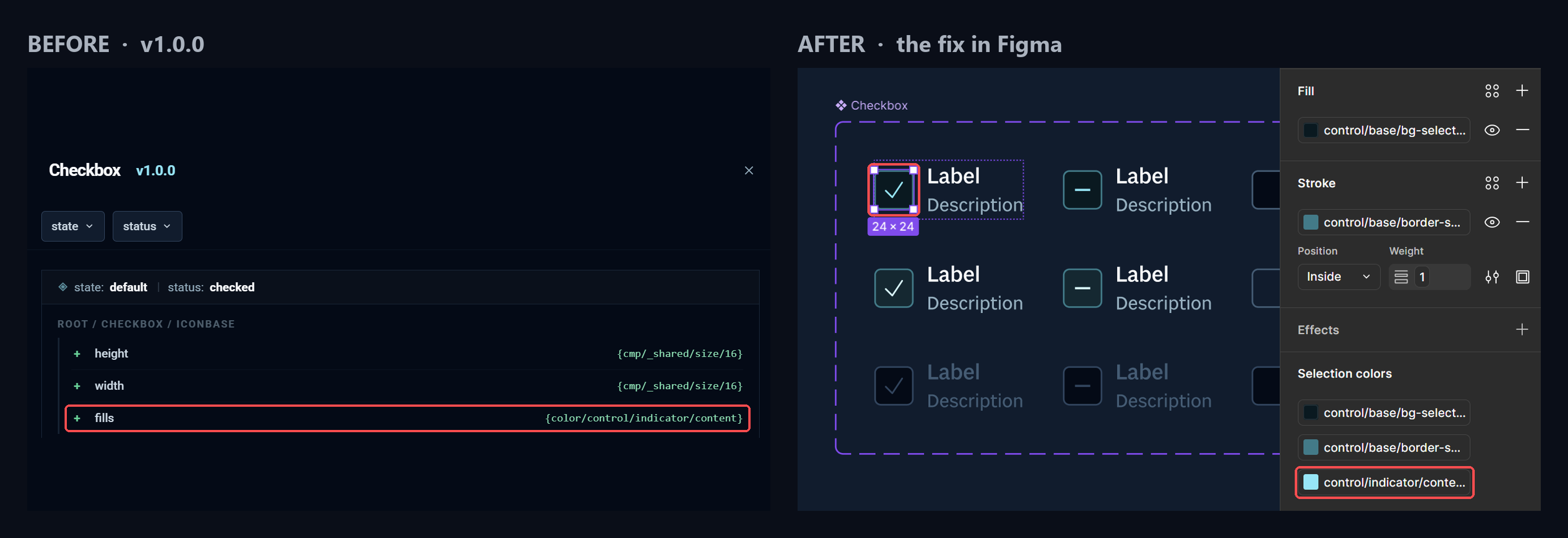
Before: v1.0.0. After: the fix in Figma. -
Step 2
Nexus checks it. The component passes its checks, and Nexus suggests a patch: v1.0.1.
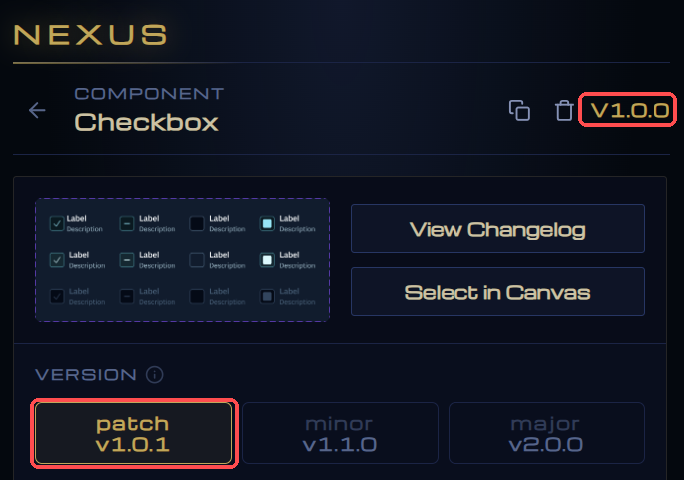
Nexus suggests v1.0.1. -
Step 3
Publish. Supabase stores v1.0.1 with its changes and preview.
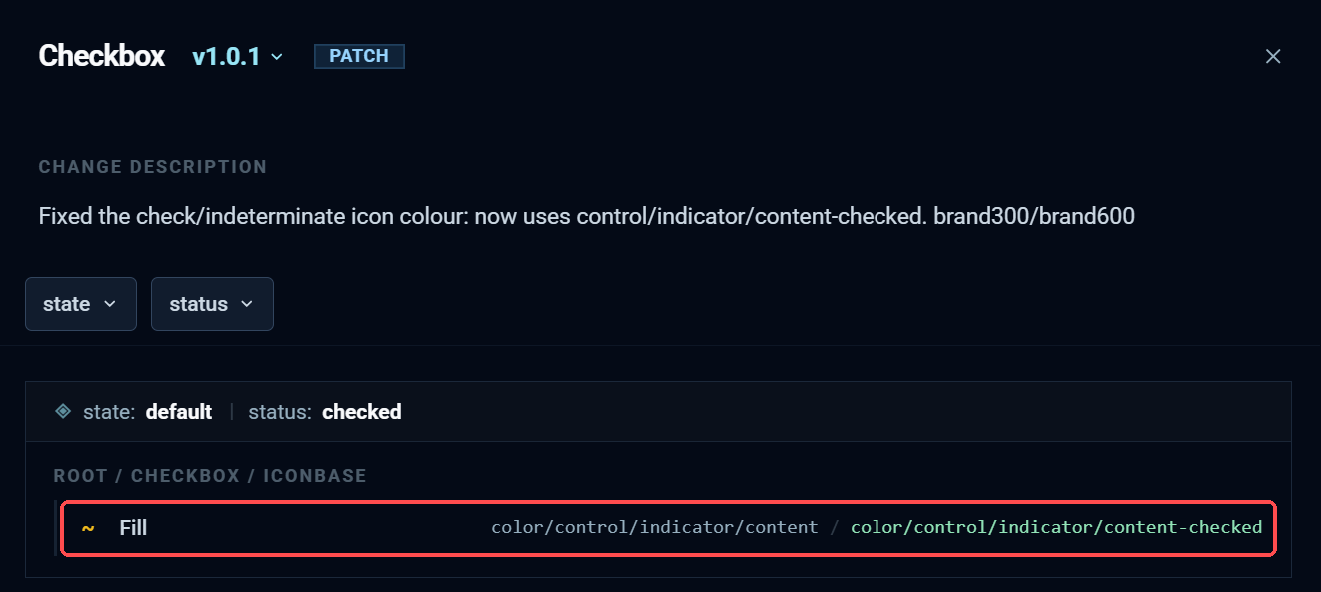
The v1.0.1 record. -
Step 4
The team hears. Slack posts the component, its version and the release note.
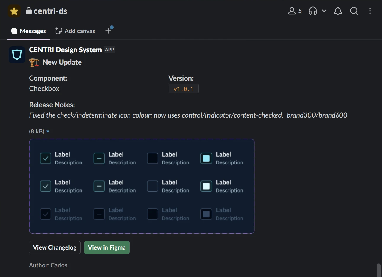
The Slack post. -
Step 5
The Showcase updates. It reads the registry, so the Checkbox page shows v1.0.1 with its new token.
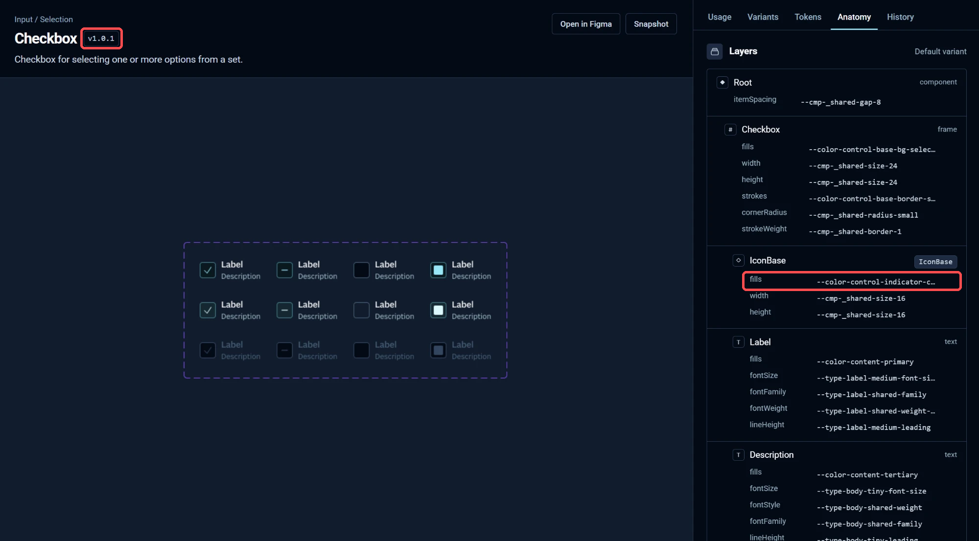
The Showcase at v1.0.1.
Checks before every release
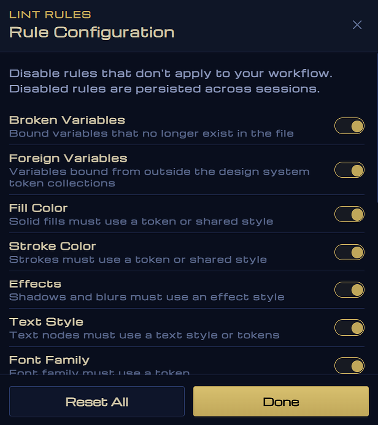
Nexus includes a linter. Before a component can publish, it runs 16 rules on each variant: every fill, stroke, effect, text style, spacing and radius must use a token, no variable can be broken or come from outside the system, and every component needs a description.
How Nexus picks a version
Nexus compares each release with the last one. It recognises 15 types of change, and the biggest one sets the version. The Checkbox fix changed one token, so it was a patch.
- PatchAppearance changes. Behaviour stays the same.
token_changedstyle_changedlayer_movedprop_default_changed1.4.0 → 1.4.1 - MinorAdds a feature existing screens can use.
variant_addedprop_addedprop_option_addedlayer_added1.4.0 → 1.5.0 - MajorExisting screens may need an update.
variant_removedvariant_renamedprop_removedprop_type_changedprop_option_removedlayer_removedname_changed1.4.0 → 2.0.0
The database checks it too: it rejects a version whose number doesn’t match its changes.
From Figma variables to JSON
Variables follow their own path to the code, and the registry keeps their history too.
-
Step 1
Pick what changed. In the Tokens tab, Nexus marks the collections that changed. It exports the Figma variables as JSON in the Design Tokens format, with a value for Dark and Light.
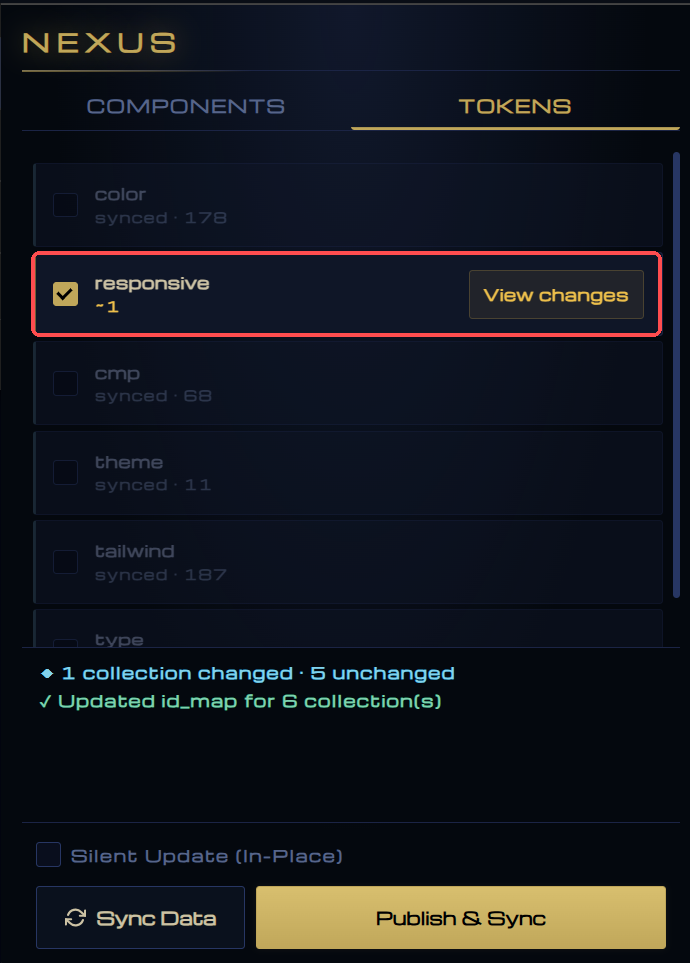
Nexus shows which collections changed. -
Step 2
Push and record. Nexus pushes every collection in one commit to the Showcase repository, so aliases between collections still resolve. Supabase keeps a version of each release, with what it added, changed or removed.
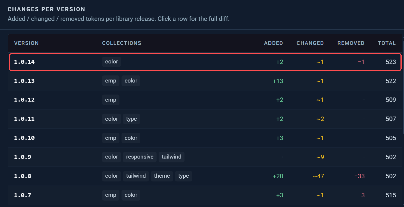
Every variable release, with what it changed. -
Step 3
Export and build. A GitHub Action turns the JSON into CSS variables: light and dark, five brands, and a Tailwind theme.
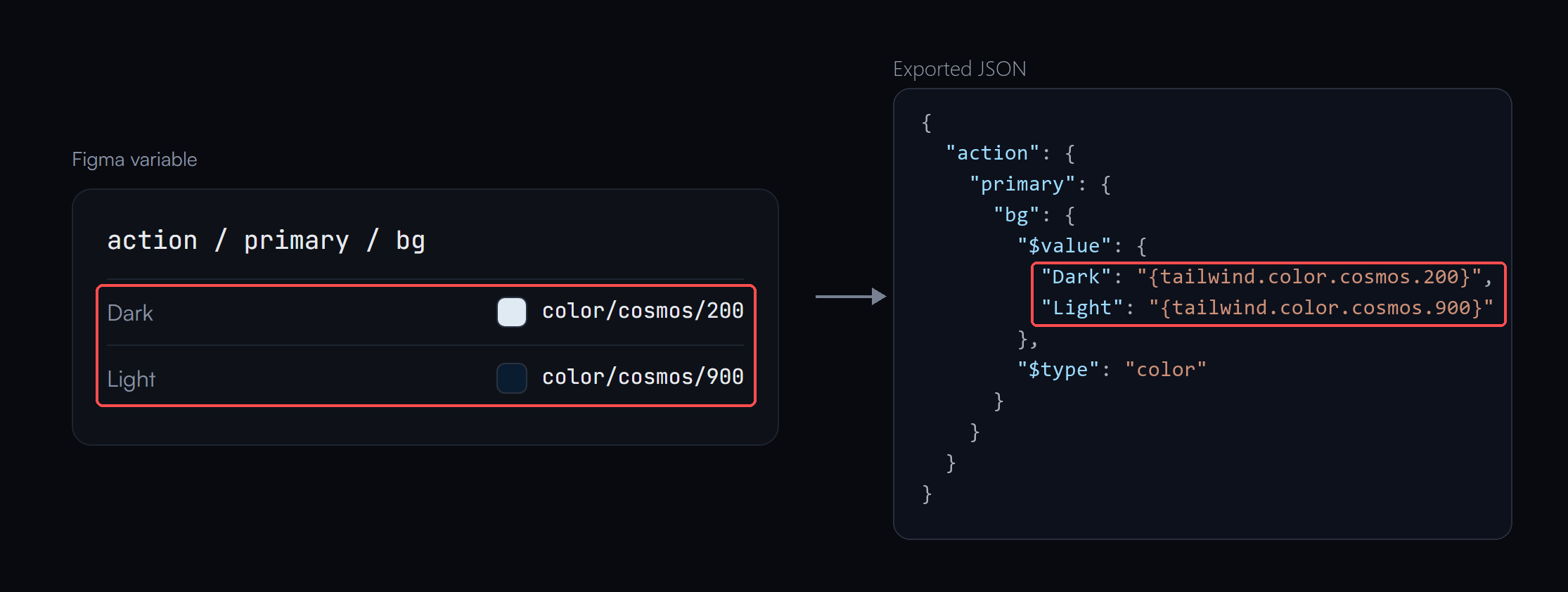
From Figma variable to JSON.
The same registry, read by agents
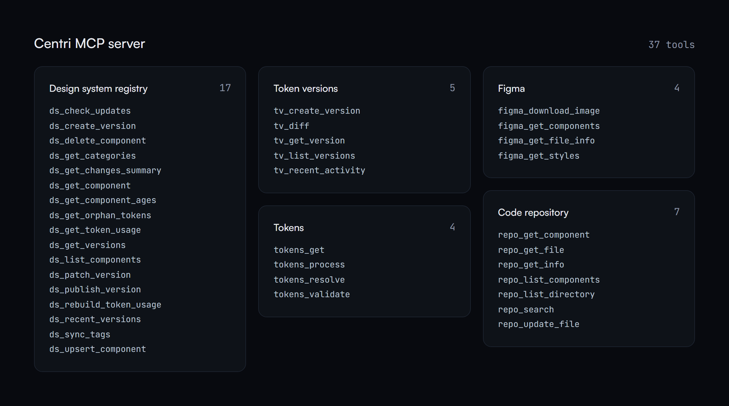
An MCP server gives AI agents 37 tools to read and update the system: components, versions, token usage and orphan tokens. They answer from the same registry the Showcase reads.
What changed for the team
Design changes used to take days to reach the code. Now tokens reach it almost immediately. Here’s what changed in the team’s daily work.
- One libraryFigma sets each value. The registry, docs and code use that same value.
- Tokens in codePublished tokens reach the repo as JSON. Checks catch values without tokens.
- Version historyThe registry and Slack show each version, what changed and its impact.
- A place to lookThe Showcase shows every component with live controls, tokens and its history.
The design team spends less time checking which version shipped.
What I’d build differently
- Share the comparison logicThe plugin and server both compare and hash versions. I’d move that logic into one tested package.
- One way to publishThe plugin and server publish separately. I’d route both through one authenticated function.
- Generate themes from FigmaMy first try generated code from Figma layers, and it copied their structure too closely to reuse. I’d keep generating themes and leave component structure to engineers.
- Check every releaseToday the visual check against Figma runs locally. I’d run it on publish and block releases that don’t match Figma.